05 Feb CABIN FEVER | Guest Bathroom Inspiration
We have been slowly but surely working on the lower level of our cabin before tackling the upstairs. You can follow along on Instagram highlight entitled CABIN. The lower level is where our office, guest room, guest bathroom and family room reside. Our current task is renovating the guest bathroom. I never realized how much goes into one of the smallest rooms in the house. So many fixtures, materials and nuances. But alas, here we are in the midst of the renovation. So I thought I would show you all of the pretty inspiration imagery and material sourcing while the guys do the dirty work.

OVERVIEW
With this room, and most of the cabin, we wanted to focus on natural materials and neutral colors. One of our main goals with this bathroom was to make it feel as open and spacious as possible. One of the ways we are doing this is by switching out the solid wood bathroom door for a door with opaque glass in the center. That way even when the door is closed, you can still get light from the hallway into the bathroom and the natural light from the bathroom window can extend into the hallway as well. We are trying to maximize the use of natural light as possible with all of our renovations.

OAK
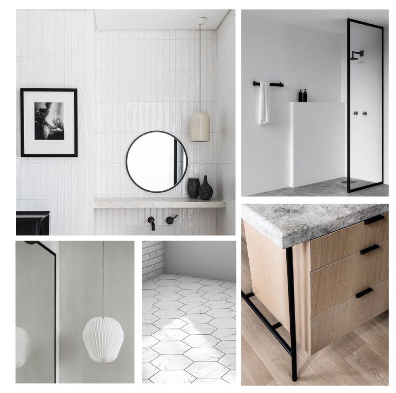
Most of the materials are black, white or charcoal with the exception of the natural oak vanity. We thought this would bring in some much needed warmth to the otherwise sterile space. I enlisted my husband to build the vanity based on the inspiration image above, which I think was originally from a kitchen island.
STONE
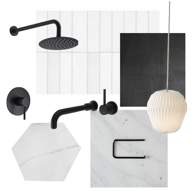
We opted for stone and stone-like materials including porcelain hexagon floor tile (similar here) and a quartzite vanity counter top from a local maker. We like the shades of grey and white that will tie in the custom concrete shower base. Since we want to extend the shower the entire width of the bathroom, there were no preexisting shower pans that were long enough, so we decided to pour our own using concrete. In order to ensure the color wasn’t too brown, we used a charcoal color mix. It is a messy process but hopefully worth it! We also love the more rustic look of the concrete, it has a bit of an industrial vibe about it. TIP: We went to a local stone yard and looked at their off-cut pieces of leftover stone slabs to find our vanity top. This saves a lot of money when you don’t need a huge piece, and they were able to cut the hole for the sink and everything.
SUBWAY TILE
In an effort to keep the room as light and bright as possible, we chose white subway tile for the shower walls. Instead of going for the traditional 3″x6″ size, we chose 2″x8″ tile and we will stack them vertically for a more streamlined and modern look.
MATTE BLACK ACCENTS
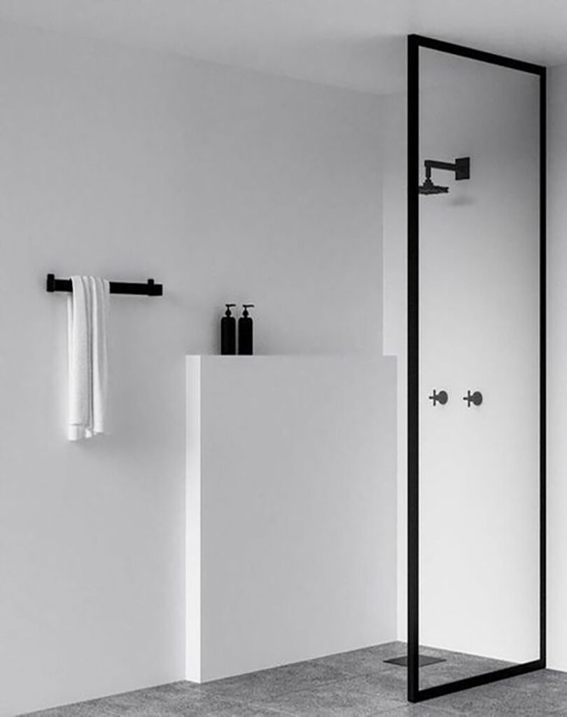
One of the first things we bought for the bathroom was the glass wall with black trim. Previously, the shower was enclosed by a wall. The glass wall is another way we could open up the space and make it feel bigger. This informed our decision to choose matte black shower and sink faucets, toilet paper holder, towel rack to finish off the rest of the room.


Sorry, the comment form is closed at this time.